photonui.GridLayout is a layout widget that allows you to align widgets on a 2D grid.
Global Options
photonui.GridLayout provides options to define its look and feel. Global options are applied to the layout itself.
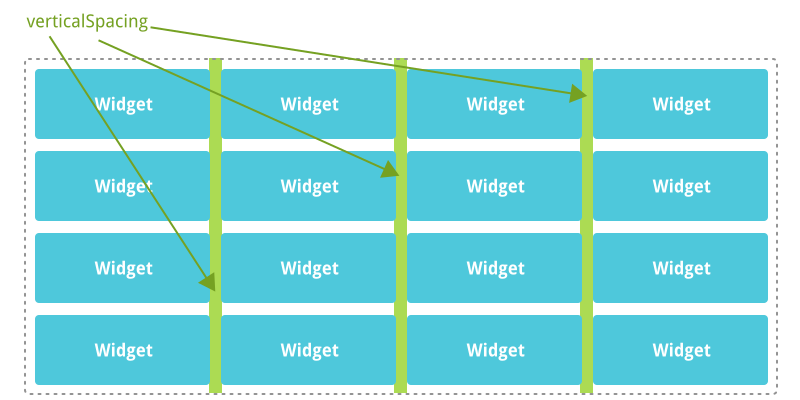
verticalSpacing
Defines the vertical spacing between the widgets (5px by default).
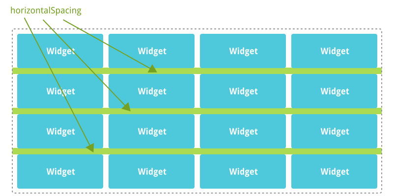
horizontalSpacing
Defines the horizontal spacing between the widgets (5px by default).
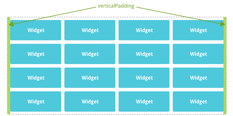
verticalPadding
Defines the spacing between the widgets and the left and right edges of the layout (0px by default).
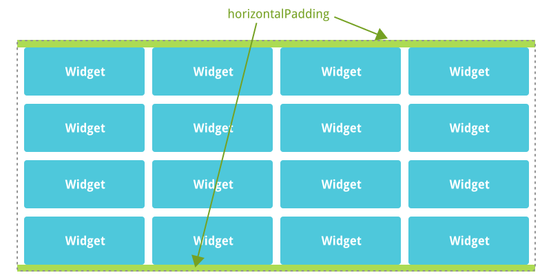
horizontalPadding
Defines the spacing between the widgets and the top and bottom edges of the layout (0px by default).
Layout Options
photonui.GridLayout allows widgets to set plenty of options to customize the way they are displayed in the layout. Layout options are associated with only one widget of the layout.
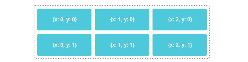
x, y
Defines the widget’s position on the grid.
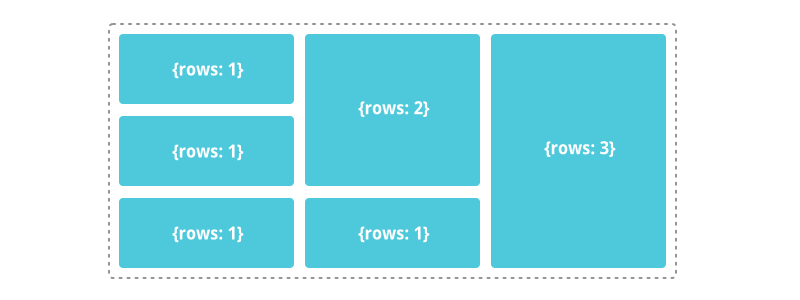
rows
Defines the number of rows the widget will fill (default = 1).
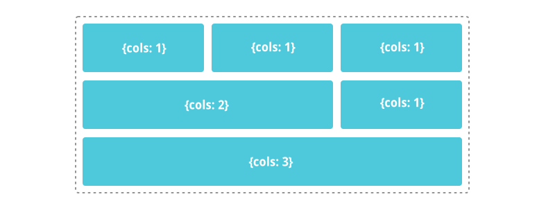
cols
Defines the number of columns the widget will fill (default = 1).
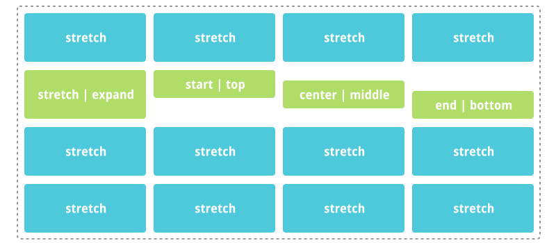
verticalAlign
Defines how the widget must be vertically aligned in the layout.
Possible values:
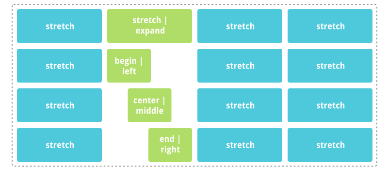
stretch(default, alias:expand): the widget is stretched to use all the available vertical space in its box,start(alias:top): the widget is placed at the top of its box,center(alias:middle): the widget is vertically centered in its box,end(alias:bottom): the widget is placed at the bottom of its box.
horizontalAlign
Defines how the widget must be vertically aligned in the layout.
Possible values:
stretch(default, alias:expand): the widget is stretched to use all the available horizontal space in its box,start(alias:left): the widget is placed at the left of its box,center(alias:middle): the widget is horizontally centered in its box,end(alias:right): the widget is placed at the right of its box.
width
Defines the fixed width of the widget (default = null, null means “auto”).
minWidth
Defines the minimum width of the widget (default = null, null means no limitation).
maxWidth
Defines the maximum width of the widget (default = null, null means no limitation).
height
Defines the fixed height of the widget (default = null, null means “auto”).
minHeight
Defines the minimum height of the widget (default = null, null means no limitation).
maxHeight
Defines the maximum height of the widget (default = null, null means no limitation).